4.07.2010

AAC block and making a thermal break


In efforts to alleviate the massive thermal break of this slab on grade construction detail, we were able to incorporate AAC block as the top course of the foundation wall. This modification, along with a cork expansion joint and exterior foundation insulation we were able to increase our R-value at this point in the wall from R-1 to R-11! Stay tuned for more detail shots and updates on this super-insulated wall.

10.14.2009

Mr. Sustainable!

Rob Brennan, AIA and Carri Beer, AIA, LEED AP

Brennan + Company's founder and Principal Architect, Rob Brennan was featured in the October issue of Baltimore Magazine. Tapped as one of the region's reigning green gurus, Rob, along with Carri Beer, talk about how to make a home environmentally friendly. It's a good read, if we do say so ourselves. Here's the link.

9.09.2009

2009 Shiny, Green Award


Photographer: Anne Gummerson

We are happy to say that our own Carri Beer, AIA, LEED, AP, and Rob Brennan, AIA, CSI, received the Natural Home Magazine 2009 Kitchen of the Year Award. They received the award for the superior integration of green materials, including recycled-paper counter tops; cork and rubber composite tiles; zero-VOC paint, PVC-free nontoxic wall coverings; 100% recycled cabinet material, and recycled-glass backsplash tiles. The addition of energy and water-saving appliances and recessed fluorescent lighting served to further enlarge the project's environmental scope.

Before Photo

Another distinction of the redesign was opening the dark, closed, 1960s kitchen and breakfast area to the living and dining rooms and the expansive view and ample daylight. The project is a great example of how a home owner can take a battered, cramped area and dramatically recreate it as a sunny, open, living space.

5.19.2009

Three Reasons to Build Your Green Dream

We think it is a very good idea to build your green home...now. You can design, plan, explore, build, add on to or renovate with green design. There are some good, sustainable reasons that building now makes sense. Here are three of them:

1. Green is now. Momentum is now. Stasis is so 90s. The time has never been better. Contractors who have scoffed at the idea of "building green," or priced it out of the market to cover their fear of the unknown, are now likely to be happy to build your project, build it more cheaply than before, and build it right. Because work opportunities are down, the costs are down and motivation is up. Builders are retraining themselves and educating their workers to build green.

2. Lending has become much more fluid. This is critical, of course. Rates are low. Many good, solid banks are growing hungry to lend. There is a lending "fragrance" in the air.

3. Building green now, will help the revolution come faster. This is a window of opportunity to change the housing market. Though you dreamed of a green home for years, it was difficult to find someone to take it on. Developers, for example, were not building green homes. Actually, they were building ecologically disastrous homes. Lots of people were. Lots of architects were! If you wanted a green home you had to fight solid resistance, even from your community housing authorities. By building green now, in a rising, favorable time, you can have a hand in changing the housing market.

Give us a call, we love green. We would love to help you design your green, dream house.

4.14.2009

137 things to know about vinyl windows

Used Vinyl Windows
We are posting a link providing a wealth of information about the durability and qualities of vinyl windows. We were impressed by the extensiveness of the data gathered and wanted to share it with our readers. Open this link and then scroll to the bottom of the page to download the PDF.

4.13.2009

Green is from the Ground Up.

Claudia Bohnert - Catonsville, Maryland
One of our client's asked us to add a geothermal system to the green energy specifications for her home renovation. Although this method of heating and cooling is used by thousands of homeowners, the choice is unique for the Catonsville neighborhood. Love's Geothermal company successfully drilled through sheer granite to reach "the source." Here's the article that appeared in the Catonsville Times.

Keep in mind that tax credits are available to homeowners who use green heating and cooling, as well as, other green options. Green begets "greenbacks."

2.03.2009

Developing the Passive House


THE COMMON ECOLOGY PASSIVE HOUSE PROJECT

The Common Ecology Passive House Project, currently under development by Brennan + Company Architects, will create a sustainable housing development model that is affordable, can be immediately deployed and has the potential to mitigate residential impacts on climate change.

The Common Ecology Passive House will apply both ancient and innovative passive heating and cooling techniques to achieve a dramatic reduction in energy demands. A symbiotic relationship between the home, the landscape, the thermal mass of the earth and the energy of the sun will accommodate almost all energy demand. Remaining energy demand will be met entirely with on-site renewable energy generation.

Building materials will be sourced locally - from the site itself or the surrounding local community - whenever possible to reduce the carbon footprint and cost of construction as well as operation. Water conservation and natural storm water management practices will reduce stress on local water sources and protect the precious Chesapeake watershed.

Tennessee Flying V

This house is located in rural Tennessee at the ridge point of the old family farm. Our clients had a dream vacation house in mind. Their dream house had to be as self-sufficient as possible and have a low environmental impact. In every respect, they believed that small would be better.


The house is 2500 conditioned square feet, slab-on-grade with radiant floors. It has been properly orientation through careful sun studies of the site. Appropriate overhangs and shading devices were added to enhance the energy efficiency.

The lumber for the house is wood milled from trees on the site. We also reuse timbers from a local barn. The house is designed with geothermal heating and cooling and solar electric panels. To add to the efficiency of the house, the north wall is strawbale. A green roof caps the project.

Local, renewable, durable, recycled materials are used throughout the interior and exterior. Environmentally friendly and money saving resource efficient equipment is also used. There are energy design details too numerous to discuss in a blog post. This is a project that meets and then exceeds our client's hopes. We like that in a house.

Sherwood Forest : Neighborhood Bungalow


This residential project is located in the lovely enclave of Sherwood Forest. The property sits on a steep ravine, on a very narrow site. The view (above) from the property to the Severn River is irreplaceable.
Our clients are deconstructing the existing house because it is seriously deteriorated. It will be replaced by the 3200 square foot design shown above.

Rear of House - looking out toward the river
We have worked closely with the neighborhood guidelines and local zoning officials to meet strict neighborhood and zoning covenants. This project is designed to maintain the historic bungalow character of the neighborhood, while at the same time incorporating many green features. The heating and cooling of the house will generated by a geothermal installation. We will be salvaging and reusing most of the existing fixtures such as hardware, lumber and hardwood floors. Expanding the green ideal, we will be using only local and renewable materials on the interior and exterior. Further, the design incorporates high insulation values and resource efficient fixtures.

Browns Go Green

The Brown family residence is located in Granite, Maryland on the ridge of a quiet wooded site. The Browns were clear about wanting to incorporate energy saving ideas into the design of their new home.


The north side of the house is earth sheltered. All the rooms were designed to have a south facing wall for maximum energy efficiency.

Many environmentally useful features were included in this 2800 sf home. They include the slab-on-grade foundation and radiant floors. Other added features include reclaimed timber structure, and structurally insulated panel (SIP) roof and wall construction. In addition local, renewable and recycled materials were integrated into the interior and exterior.
The placement of appropriate shading and overhangs were determined by using thorough, detailed sun studies. When you consider resource efficient equipment, a rain garden, and all the additional features that were incorporated into the design, you could fairly say, the Browns were effectively greened.

This project designed by Carri Harlan in
association with Julie Gabrielli, while at Terralogos.

Takoma Park : Sustainable Community


The Epstein residence is located in the well-established Takoma Park neighborhood in Maryland, the first planned commuter suburb in the region. The Takoma Park area is the home to multi-gabled affairs of Queen Anne Architecture with Stick Style and Shingle Style influence.


The owners deconstructed a small house and replaced it with this 4500 square foot residence. Much effort was put into designing this modern house so that it fit into the proportion and historic character of the neighborhood.


This residence is rich with green features: radiant floors, high efficiency mechanical equipment, resource efficient fixtures and appliances. All the interior and exterior wood trim is from reclaimed sources. It also incorporates wheatcore doors and durable materials, as well as local, renewable and recycled materials throughout the interior and exterior.

Takoma Park is a unique, historic neighborhood. This house fits nicely into its context and also achieves a full range of sustainable living solutions.

This house with designed by Carri Harlan in collaboration with Julie Gabrielli while at terralogos ecoarchitecture.

12.29.2008

Kitchens we have loved.


Kitchens - the engine of the house. All engines run similarly, but unlike engines, kitchens must satisfy the aesthetic of its owner.

Creating a kitchen that fulfills the aesthetic, and also meets a family's functional demands, requires careful attention to materials, scale, detail and history. A kitchen design must consider the context of the house vocabulary and its relationship to the house plan and site, overlaid with the family's use patterns and lifestyle.

We have assembled a slideshow of a few of the kitchens that reflect these considerations. Many of these examples were kitchen restorations that required integrating the design into a historic style. The larger task of the design of the kitchen is to fully integrate the kitchen into the whole of the house, in a seamless manner. This process requires an awareness of the subtleties of design, style and space. It is what the best architectural design is about. We believe these are good examples of that achievement.

[Slideshow notes: To review some details about each image, move your cursor to the top of the frame to reveal "Show info" and click on the words. Click "Show info" again to turn off the text. Move your cursor to the bottom of the frame to reveal thumbnail images or to pause the slideshow.]

12.11.2008

Baths we have loved.


A thoughtful bathroom can expand the sense of comfort that a well designed home offers. The bathroom is a place of shelter and rejuvenation. The space must provide warmth, refreshment, intimacy and comfort. The innovative use of materials and the selection of appropriate plumbing and lighting fixtures can amplify its sense of comfort and repose. In this respect, the size of the bath is not as important as its details and materials.

Whether it is the master bath or the children’s bath, the space requires thoughtful consideration. Because a bathroom is so necessary and basic, many forget to bring design into it and it becomes a collection of objects pushed to the walls---a sink, shower, bathtub and toilet. We have found that working with tactile materials such as concrete counters, glass tile and woods, for example, integrates these basic plumbing fixtures into a larger, refreshing whole. Rather than being a utilitarian space, good design creates a bathroom that is a center of peacefulness and tranquility in our home.

We have assembled a slideshow of custom baths we have renovated or built from scratch that reflect these ideas.


[Slideshow notes: To review some details about each image, move your cursor to the top of the frame to reveal "Show info" and click on the words. Click "Show info" again to turn off the text. Move your cursor to the bottom of the frame to reveal thumbnail images or to pause the slideshow.]

9.15.2008

Swell House - Double Award Winner 2008

Swell House - Entrance
Flickr slideshow


MINIMUM SPACE - MINIMUM BUDGET

We recently received a Citation from the Maryland Chapter of the American Institute of Architects, 2008 Design Awards, and a Honorable Mention in the Baltimore Chapter of the American Institute of Architects 2008 Excellence in Design Awards competition, in the Single Family Residence Category, for the home we designed entitled: "Swell" House.

This tiny, 660 square foot, Baltimore City row house is actually and alley house, off an alley. The homeowner was working with minimum footage and a minimum budget. She sought to incorporate as much green material and systems as her budget would allow. Because the construction dollars were directed to her green priorities, this first phase of the home was completed without the built-ins that will finally shape the house in the second phase.

The original first floor of this classic alley house, had an elongated sequence of rooms. Upon entering, one walks a straight line through the living room, dining room, kitchen and a bathroom. The second floor traditionally had two tiny bedrooms, one for the kids and one for the parents. We inverted this form to recognize our 21st Century sensibilities. We located the kitchen and living area on the second floor and extended a deck out beyond the kitchen. We made the first floor into a quiet, low-lit, master suite with bedroom, bathroom and walk-in closet.

The owner's wish was to create a modern, colorful living space, that was thin, luminous and light. We first gutted the house to abate the lead, leaving the original, narrow, space-saving staircase in the center of the house. Energy-Star appliances, energy-saving HVAC equipment, a dual-flush toilet, batt insulation, bamboo flooring and recycled rubber flooring provided energy and sustainability solutions. We added aluminum clad, energy-efficient, Low-E Weathershield casement windows.

We integrated galvanized aluminum and polycarbonate ¾ walls on aluminum studs to save money and to provide “thin” solutions to save space and, in the case of the polycarbonate wall, provide luminosity. We designed sliding doors on industrial tracks to save further space.

The kitchen appliances are simple GE appliances that were purchased from a small local dealer. The kitchen cabinets are inexpensive Ikea brand, however, they are an interesting mix of two different models providing a more dynamic look. Simple perforated metal was used on the stairwell railing and echoed on the deck railing.

Small house. Small budget. Swell result.


5.22.2008

Porches we have loved


Our client's, as part of their renovation or addition, often decide to add a porch. Over the last few years we have produced many that we really enjoy seeing. Here is a Flickr slide show of some of them to inspire winsome summer thoughts.

5.06.2008

Small. Historic. Green.


We wanted to post this project because the owner's desire for green home certification and tax credits prevailed over the sometimes daunting process . This historic home was remodeled to meet both Virginia Historic Tax Credits and Arlington County Green Home Choice Program certification. Both ratings were hard won through persistence and good design.

The house maintains its existing footprint, saving the surrounding land from additional loss. Waste management practices were employed from the demolition stage through the construction phase.

The lower lever of the rear section of the house was a one-story screened porch.
The former porch was turned into a family room and the second floor became an additional bedroom.


Green materials and highly efficient lighting pervade the house. Good quality, original materials from one part of the house were reused in other parts. At least ten doors, which would normally be discarded during renovation were reused in another part of the house. To do this we identified, early in the design process, which doors would be reused, then sized the frame at the door's new home, in the drawings, for the builder. Bricks that were removed, to make way for new windows, were reused to expand the front entrance porch. Hardwood floors from the first floor were reused in the second floor bedroom. The reuse of good, historic, materials enhances the authenticity of a historic home. Importantly, reuse contributes to the reduction of waste and the unnecessary use of our limited environmental resources.

Water efficient systems and appliances were installed to reduce water usage. This included dual flush toilets, a tankless water heater, washer/dryer, and even rain barrels on the exterior to catch run-off water for garden watering.

The renovation and new addition for this house included a new family room, dining room, study, office, powder room, and parlor on the first floor. On the second floor an additional bedroom and bath were added. The basement was redesigned to provide a playroom, mudroom and laundry room.

With good planning, useful space can be increased substantially. When sustainability is a priority, the overall effect is increased value and a home environment that is both beautiful and healthy.


Entrance Hall - new 1/4 wall with storage
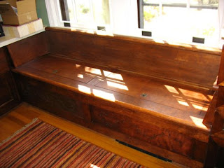

New built-in window bench


New stained cedar overhang at rear


Recycled Icestone glass counter top


Recycled glass tile throughout 2nd floor bath


Concrete counter top, recycled glass back splash, master bath


New built-in reading nook for children.


Birch plywood counter with color wash.
Attractive, inexpensive counter top solution.
High efficiency, under counter washer and dryer.

4.29.2008

USE THE SPACE YOU HAVE : Works in Progress

Often a homeowner's first thought when they are running out of space is to add an addition. This home is a good example of another way to solve the space problem. When we saw the interior, we were able to determine that the small, unused attic provided all the space that this family needed, at less cost than adding an addition. The attic can now serve as a full second floor with two bedrooms, a much needed office and two baths.

To create this new space, we added dormers, sky lights and a new stair. We were able to maintain the original footprint, the house's historic character and, importantly, the proportions of the original house. We think it is a good way to enlarge a house and bring daylight in, while at the same time maintaining its character in the community. This solution also fit with our sense of environmental ethics: using what we have, reducing our impact on the earth and supporting the ideas of the not-so-big housing movement.


BEFORE - exterior


AFTER - exterior


BEFORE - exterior rear


AFTER - exterior rear


BEFORE - interior


BEFORE - Interior


AFTER - Interior


AFTER - interior


AFTER - interior skylight


AFTER - new bathroom taking shape


AFTER - new stairs underway

4.02.2008

Helpful Hints


Helpful hint #1: Save the planet!
These floors are salvaged oak flooring purchased from Second Chance, Inc. in Baltimore, Maryland. They have been installed and refinished. They look absolutely beautiful. The character and color of these old floors enhances the warmth of the space.

Our client was able to save a substantial sum by buying the recycled flooring. It is noteworthy that the actual installation of the recycled flooring was more expensive than installing new flooring, because of the wood filling and fitting that was required. However, it is fair to say that the when you add up the installation and purchase costs of recycled flooring versus new flooring, the difference is insignificant. The value to the planet of recycling rather than plundering our forests is impossible to quantify, but is part of the worth to be considered. And then, of course, the recycled floors provide an authenticity and beauty that cannot be achieved with newly manufactured wood.

Oh, yes. Remember, when going for a satin finish, the first coat should be glossy. The glossy finish provides a harder coating to protect the floors. The satin finish goes on top of the glossy.

Helpful hint #2: Save money with thoughtful design!
This tiny bathroom is only 5 feet wide. We used lots of windows, including our favorite ‘porthole in the shower’ and an affordable, beautiful finish palette. The field tile is an inexpensive 3x6 ceramic from Daltile. We added a splash of luxury with a band of Oceanside’s glass tile. We also saved money by switching to plywood beadboard wainscot in the sink area, but continued the glass tile to tie everything together.


4.01.2008

Improvisation on Color


We are in the final stages of a renovation that includes a new kitchen which you can see under construction in these two photos.

When the green, glass tile arrived for installation on the back splash, our client was not comfortable with the brightness of the color, nor the yellow hue. Looking at the three samples below, our client thought she had chosen the darker second tile, but in a mix-up, she had actually selected the first. Because it would require a minimum of a five-week turnaround to secure the darker color of this tile, time we did not have, we decided to improvise.


Normally a white or off-white grout would serve to frame the tile. Because we were working with glass tile, the white grout would also be seen through the tile and lighten the color. In order to "tune-down" the brightness, and get back to the darker color our client desired, we asked our tile installer to experiment with a gray grout.

The results were very interesting! The color quieted down and darkened perfectly. We think the green with the gray is also a very sophisticated look. Everyone is pleased. We wanted to share this solution with our readers. Below is an image of the mock-up of the tile with gray grout.